
Writing a detailed report is only half the job. Whether you’re presenting research findings, a project update, sales performance, or business insights, you’ll often need to transform that report into a presentation that’s easy to understand and engaging for your audience.
The challenge is that reports and presentations serve different purposes. Reports provide detailed information, while presentations highlight the most important insights using visuals, concise text, and a clear narrative.
In this guide, you’ll learn how to turn a report into a PowerPoint presentation step by step, what information to include, common mistakes to avoid, and how AI can help speed up the process without sacrificing quality.
Why Turn a Report into a PowerPoint Presentation?
A report is designed to be read. A presentation is designed to be delivered.
When you present a report directly from a document, your audience may struggle to follow long paragraphs, detailed tables, or technical language. A well-designed slide deck helps communicate the same information more effectively.
Creating a presentation from your report helps you:
- Highlight key findings instead of every detail
- Keep meetings focused and engaging
- Explain complex data with charts and visuals
- Make recommendations easier to understand
- Improve audience retention
- Save time during presentations
Instead of reading pages of content, your audience quickly understands the main message through structured slides.
Report vs. PowerPoint Presentation
Although both communicate information, they are built differently.
| Report | Presentation |
| Detailed explanations | Key takeaways |
| Long paragraphs | Short bullet points |
| Extensive data | Visual charts and graphs |
| Read individually | Delivered to an audience |
| Comprehensive documentation | Storytelling with visuals |
The goal isn’t to copy your report onto slides. It’s to simplify the information while keeping the core message intact.
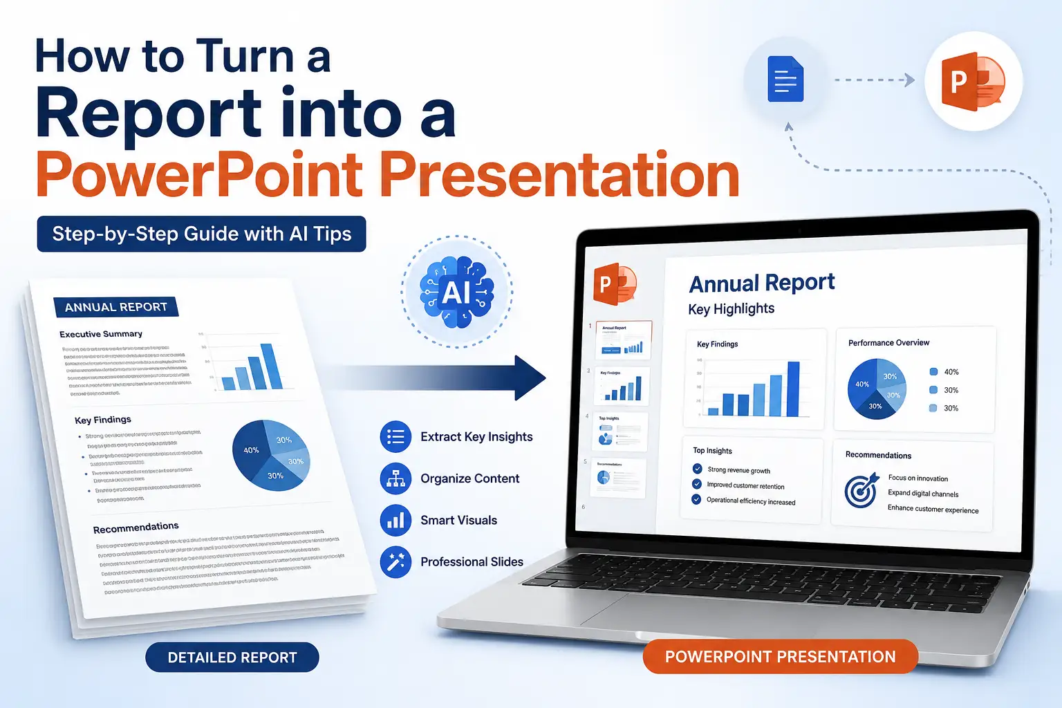
How to Turn a Report into a PowerPoint Presentation?
To turn a report into a PowerPoint presentation:
- Define your audience and objective.
- Extract the key findings and recommendations.
- Organise the content into a logical slide structure.
- Replace paragraphs with concise bullet points.
- Use charts and visuals to explain data.
- Review and refine your slides before presenting.
Step 1: Identify Your Audience and Goal
Before creating slides, decide who you’re presenting to and what they need to know.
Different audiences expect different levels of detail:
- Executives: Key insights and recommendations
- Clients: Results and next steps
- Managers: Performance, progress, and risks
- Students: Research findings and conclusions
Your presentation should focus on one clear message rather than covering every detail in the report.
Step 2: Extract the Key Information
Don’t copy your report into PowerPoint. Instead, identify the most important points, such as:
- Executive summary
- Objectives
- Key findings
- Important data and charts
- Recommendations
- Conclusions
Keep one main idea per slide and use visuals wherever possible. The detailed explanations can stay in the report while the presentation highlights the insights that matter most.
Step 3: Create a Logical Slide Structure
A clear structure makes your presentation easier to follow. Instead of creating slides randomly, organise them into a simple story.
A typical report presentation includes:
- Title slide
- Agenda
- Objectives
- Key findings
- Supporting data and visuals
- Recommendations
- Conclusion
- Q&A
Keep each slide focused on a single topic. This improves readability and helps your audience stay engaged throughout the presentation.
Step 4: Simplify the Content
Slides should support your presentation not replace it.
Follow these best practices:
- Replace long paragraphs with short bullet points.
- Use clear headings that summarise the slide.
- Highlight important numbers and insights.
- Keep text concise and easy to scan.
If a section needs a detailed explanation, discuss it while presenting instead of adding it all to the slide.
Step 5: Use Visuals to Explain Data
Visuals make complex information easier to understand than blocks of text.
Where appropriate, replace tables and paragraphs with:
- Bar and line charts for trends
- Pie charts for proportions
- Icons to highlight key points
- SmartArt or process diagrams for workflows
- Images that support your message
Choose visuals that add clarity rather than decoration. Every chart or graphic should reinforce your key takeaway.
Step 6: Review and Refine Your Slides
Before presenting, review your deck to ensure it’s clear, accurate, and consistent.
Use this quick checklist:
- ✓ One main idea per slide
- ✓ Clear, descriptive headings
- ✓ Minimal text and easy-to-read fonts
- ✓ Consistent colours and formatting
- ✓ Data and visuals are accurate
- ✓ Presentation flows logically from start to finish
A final review helps you catch errors and ensures your presentation communicates your report confidently and effectively.
Also read: How to Convert Webinar to Presentation?
Turn Your Report into a PowerPoint Presentation Faster with AI
Instead of manually copying content into slides, an AI presentation maker can analyse your report, identify the most important sections, organise them into a logical presentation structure, and generate a professionally designed slide deck in minutes. You can then review the content, make edits, and customise the design before presenting.
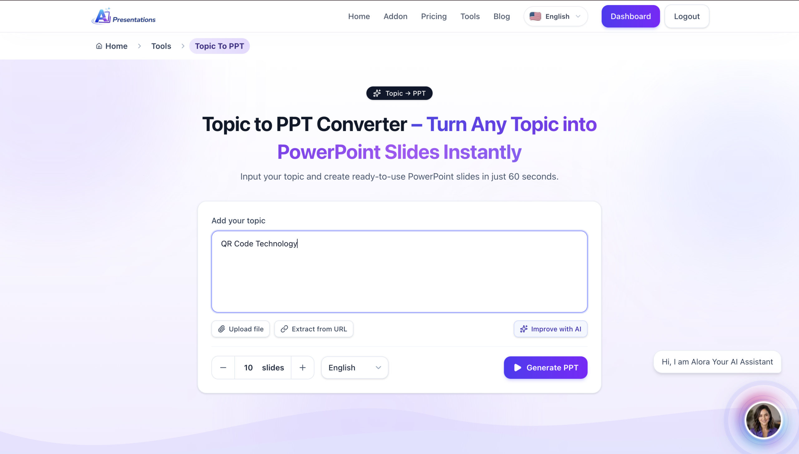
An AI Slide maker can automate much of this process by:
- Summarising lengthy reports into key points
- Organising content into a logical slide flow
- Creating professionally designed slides
- Suggesting layouts, icons, and visuals
- Saving hours of manual formatting
Instead of starting from a blank presentation, you can generate a structured slide deck in minutes and then customise it to match your audience and brand.
Tip: Always review AI-generated slides to ensure the content is accurate, relevant, and aligned with your presentation goals before presenting.
Common Mistakes to Avoid
When turning a report into a presentation, avoid these common mistakes:
- Copying entire paragraphs onto slides
- Overloading slides with too much data
- Using too many charts or animations
- Including information that isn’t relevant to your audience
- Reading slides word for word during the presentation
Remember, your slides should highlight the key insights, while you provide the context and explanation during your presentation.
Also read: How to Add Video to Google Slides?
Frequently Asked Questions
Q1. How do I turn a report into a PowerPoint presentation?
Start by identifying the key findings, objectives, and recommendations from your report. Organise them into a logical slide structure, replace long paragraphs with concise bullet points, and use charts or visuals to explain data.
Q2. How many slides should a report presentation have?
It depends on the report’s length and your presentation time. For most business or academic presentations, 10–15 slides are enough to cover the key points without overwhelming your audience.
Q3. What should a report presentation include?
A report presentation typically includes:
- Title
- Objectives
- Key findings
- Supporting data
- Recommendations
- Conclusion
- Q&A
Q4. Should I copy my report directly into PowerPoint?
No. Reports are designed to be read, while presentations are designed to be delivered. Focus on summarising the most important information instead of copying entire sections.
Q5. How can I make my report presentation more engaging?
Use concise text, clear headings, relevant visuals, charts, and a logical flow. Aim for one key idea per slide and explain the details verbally during your presentation.
Q6. Can AI help create a presentation from a report?
Yes. AI presentation tools can summarise lengthy reports, organise content into slides, and generate a professional presentation in minutes. You can then review and customise the slides before sharing or presenting.
Final Thoughts
A successful report presentation isn’t about including every detail it’s about presenting the right information in a way that’s easy to understand. By focusing on key findings, using visuals effectively, and following a logical structure, you can create presentations that inform, persuade, and drive better decisions.
If you’re looking to save time, AI Presentations can help you turn reports into polished PowerPoint presentations in minutes, making it easier to share insights with clients, teams, or stakeholders.
Also read: How to Transfer PowerPoint to Google Slides?