
Creating a professional PowerPoint presentation is about more than choosing an attractive template. A polished presentation needs a clear message, logical structure, readable slides, consistent design, and visuals that help the audience understand your ideas.
The good news is that you don’t need advanced design skills to create professional-looking slides. With the right process, you can turn a basic collection of information into a presentation that looks organized, credible, and engaging.
In this guide, I’ll walk you through how to make a professional PowerPoint presentation from planning your content to designing the final slides.
What Makes a PowerPoint Presentation Look Professional?
A professional PowerPoint presentation usually has five characteristics:
- A clear objective: Every presentation has a specific purpose.
- Logical structure: Ideas flow naturally from one slide to the next.
- Consistent design: Fonts, colors, layouts, and spacing follow a visual system.
- Readable content: Slides aren’t overloaded with paragraphs or tiny text.
- Purposeful visuals: Images, charts, diagrams, and icons support the message.
Professional slides don’t necessarily need complicated animations or elaborate graphics. In many cases, simple and consistent design looks more polished than an overcrowded slide.
How to Make a Professional PowerPoint Presentation
1. Start With a Clear Presentation Objective
Before opening PowerPoint, decide what you want your audience to understand, remember, or do after the presentation.
For example, a business presentation might aim to:
- Explain a new strategy
- Present quarterly results
- Introduce a product
- Persuade a client
- Get approval for a project
Having one clear objective makes it easier to decide what information belongs in your presentation.
If a slide doesn’t support your main objective, consider removing it.
2. Understand Your Audience
A professional presentation should be designed for the people who will see it.
Think about:
- What does your audience already know?
- What information do they need?
- How much technical detail is appropriate?
- What questions are they likely to ask?
- What action do you want them to take?
A presentation for executives, for example, may need concise insights and data, while a classroom presentation may require more explanation and examples.
3. Create the Presentation Structure Before Designing Slides
One of the biggest mistakes is opening PowerPoint and immediately designing individual slides.
Start with an outline instead.
A simple professional presentation structure could be:
- Title slide
- Introduction or context
- Problem or opportunity
- Key information or analysis
- Proposed solution
- Supporting evidence
- Recommendations or next steps
- Conclusion
This creates a logical flow and prevents your presentation from becoming a collection of unrelated slides.
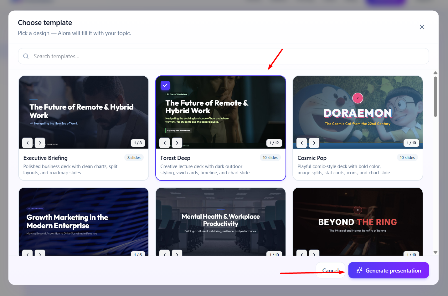
4. Choose a Clean and Consistent Template
A good PowerPoint template gives your presentation a visual foundation.
Choose a design that matches your subject and audience. A corporate presentation may benefit from a clean, minimal layout, while a creative presentation can use more expressive visual elements.
Whatever template you choose, maintain consistency throughout the presentation.
Use the same general:
- Font family
- Color palette
- Heading style
- Slide spacing
- Image treatment
- Layout system
Consistency makes even relatively simple presentations look more professional.
5. Use Professional Fonts and Readable Text
Typography has a major impact on how your presentation feels.
Choose fonts that are easy to read from a distance and avoid using too many different typefaces.
A practical approach is to use:
- One font for headings
- One font for body text
- A clear size difference between titles and supporting text
Don’t try to fit an entire report onto a slide. Your presentation should support what you say rather than replace your speech word for word.
Instead of putting a long paragraph on a slide, identify the main idea and present it in a concise format.
6. Keep Each Slide Focused on One Main Idea
A professional slide should have a clear purpose.
Ask yourself:
“What is the one thing my audience should understand from this slide?”
Then design the slide around that message.
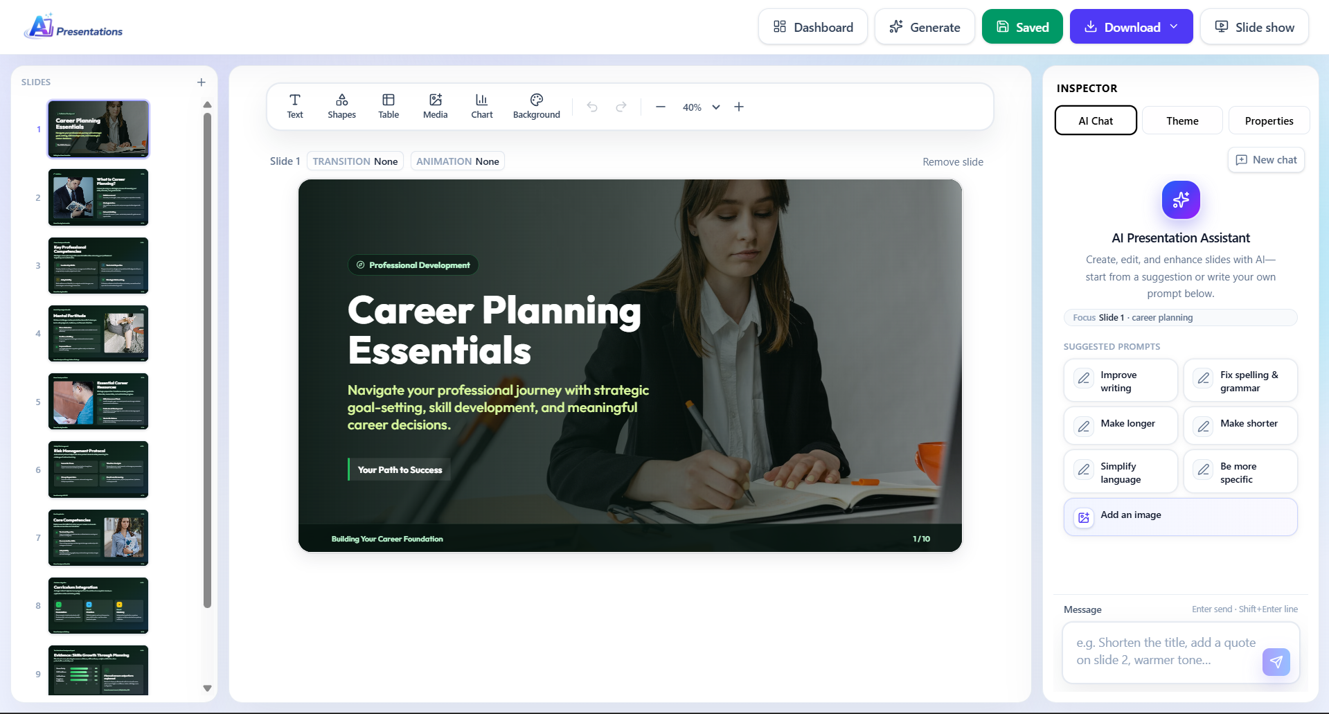
For example, instead of creating one crowded slide containing five different business metrics, you could dedicate individual slides to the most important insights or group related information into a clear visual.
This improves both readability and audience comprehension.
7. Use Visuals to Explain Information
Images, charts, diagrams, icons, and other visual elements can make complex information easier to understand.
But don’t add visuals simply because a slide looks empty.
Every visual should serve a purpose.
Use:
- Charts for data
- Timelines for chronological information
- Diagrams for processes
- Icons for simple concepts
- Images when they add context or emotional impact
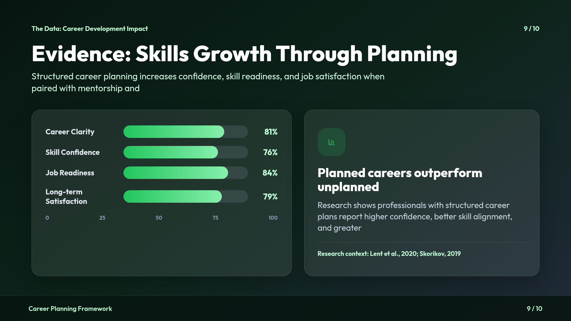
A good visual should help the audience understand your message faster than text alone.
8. Create Strong Visual Hierarchy
Visual hierarchy tells your audience where to look first.
You can create it through:
- Font size
- Weight
- Position
- Contrast
- Spacing
- Color
- Scale
For example, your slide title should immediately communicate the topic, while the supporting information should be visually secondary.
Avoid making every element equally prominent. If everything is emphasized, nothing stands out.
9. Use White Space Instead of Filling Every Area
One common mistake is trying to use every available part of a slide.
Professional presentations usually have enough breathing room around text, images, and other elements.
White space makes slides easier to scan and prevents them from feeling cluttered.
If a slide feels crowded, don’t immediately reduce the font size. First ask whether some content can be removed, combined, or moved to another slide.
10. Make Data Easy to Understand
If you’re presenting statistics, don’t simply paste a large spreadsheet into PowerPoint.
Identify the key insight first.
For example, instead of showing ten numbers, highlight the metric that matters most and use a chart or visual comparison to communicate the trend.
Your audience shouldn’t have to study the slide for several minutes to understand what you’re trying to say.
11. Make the Opening and Conclusion Strong
Your first few slides should quickly establish why the presentation matters.

A good opening can introduce:
- The problem
- The opportunity
- A surprising finding
- A question
- The main objective
Your conclusion should then reinforce the key message.
Don’t end abruptly with a generic “Thank You” slide. Summarize the most important takeaway and, where appropriate, clearly state the next step.
How to Create Professional Slides Faster With AI
Creating a professional PowerPoint manually can take considerable time because you have to research the topic, create an outline, write slide content, organize information, choose layouts, and format every slide.
This is where AI can help.
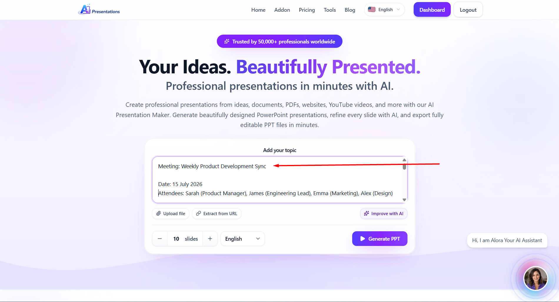
With AI Presentations, you can start with a topic or source material and generate a structured presentation that provides a starting point for your slides. You can then review the generated content, customize the presentation, and refine the design before using the final PPT.
Instead of starting with a completely blank PowerPoint or Google Slides file, the workflow becomes:
Idea → Outline → Slide content → Designed presentation → Edit → Final PPT

The important part is still your judgment. AI-generated slides should be reviewed for accuracy, relevance, tone, and audience fit before you present them.
Common Mistakes That Make PowerPoint Presentations Look Unprofessional
Avoid these common presentation mistakes:
- Too much text: Large paragraphs make slides difficult to read and encourage the audience to read instead of listening.
- Inconsistent formatting: Changing fonts, colors, alignment, and layouts from slide to slide can make an otherwise good presentation look unfinished.
- Too many colors: A small, intentional color palette usually looks more professional than using a different color for every element.
- Unnecessary animations: Animations should support your presentation, not distract from it.
- Low-quality visuals: Blurry images and poorly designed graphics can reduce the perceived quality of the entire presentation.
- Trying to say everything: A presentation isn’t a document. Keep the slides focused and use your spoken explanation to provide additional context.
Recommended to check: How to End a Presentation (With Examples That Leave a Lasting Impression)
Final Checklist for a Professional PowerPoint Presentation
Before presenting, review every slide and ask:
- Is the purpose of the presentation clear?
- Does every slide have a clear message?
- Is the content easy to read?
- Are fonts and colors consistent?
- Are the visuals relevant?
- Is there enough white space?
- Are charts easy to understand?
- Does the presentation flow logically?
- Is the conclusion memorable?
- Have I checked the presentation for errors?
If the answer is yes, your presentation is much more likely to look polished and professional.
Create a Professional Presentation Without Starting From Scratch
A professional PowerPoint presentation doesn’t require complicated design. The most important elements are a clear objective, logical structure, concise content, consistent design, and visuals that support your message.
If you’re short on time, AI can reduce the amount of manual work involved in creating the first version of your presentation. AI Presentation Tool can help you turn an idea or source material into a structured presentation, giving you a starting point that you can customize and refine.
The goal isn’t to let AI replace your judgment. It’s to spend less time building slides from scratch and more time improving the ideas, storytelling, and message behind your presentation.
Frequently Asked Questions
How do you make a PowerPoint presentation look professional?
Use a clear structure, consistent fonts and colors, concise text, strong visual hierarchy, and relevant visuals. Avoid overcrowded slides and keep each slide focused on one main idea.
What should a professional PowerPoint presentation include?
A professional presentation typically includes a clear introduction, well-organized main content, supporting visuals or data, key takeaways, and a strong conclusion. The exact structure depends on your audience and presentation goal.
What makes a PowerPoint slide look professional?
Consistent formatting, readable typography, balanced spacing, high-quality visuals, and a simple layout can make PowerPoint slides look more professional. Avoid excessive text, colors, animations, and decorative elements.
How many slides should a professional PowerPoint presentation have?
There is no fixed number. The presentation should contain enough slides to communicate the message clearly without adding unnecessary information. Focus on the amount of content and time available rather than trying to hit a specific slide count.
Conclusion
A professional PowerPoint presentation doesn’t need complicated designs or excessive visual effects. Clear messaging, logical structure, consistent design, readable content, and purposeful visuals matter much more.
Start by defining your objective and audience, build a simple structure, and then design each slide around one clear idea. Before presenting, review the entire deck for consistency, readability, and unnecessary content.
If you’re spending too much time starting presentations from a blank slide, AI Presentations App can help you create a structured first draft from your topic or source material. You can then edit, customize, and refine the slides to match your presentation and audience.
Related: How to Start a Presentation That Captivates Your Audience (With Examples)